Thursday, 26 August 2010

Supermutant Animal Duels 2

Oh dear, it's that time again. More ridiculous animal fights. Part one is here if you don't know what I'm going on about...

So, the films in the season 2 box set are:

Annihilation Prawn vs Surveillance Duck
Electro Possum vs Necro Stoat
Ghost Owl vs The Infinite Shark
Astrosnail vs Time Vole
Frozen Chicken vs Hungry Mule
Punchy Octopus vs Soggy Lion (From The Rainforest Of Lions)
Happy Puppy vs Speedgoat
Murderous Eel vs Agoraphobic Sparrow
Sadomasochistic Kitten vs Vampire Platypus
Kamikaze Maggot vs The Incredible Whelk

So there you have it. It's been suggested that I attempt to sketch all of these creatures... maybe someday if I find the time I'll have a go at a couple of them.

Thanks for all the suggestions and contributions to this particularly socially relevant topic of discussion. Season 3 is coming soon...

Monday, 9 August 2010

Recipe: The Colonel

To follow up from the last recipe, here's another drink for your banquet.

For this concoction, I'm going to show you the sketch before telling you about it. See if you can guess what it contains just from the diagram.


Right. Yes, it looks like a power station cooling tower. That is because the drinking vessel of choice for this one is a vase. Preferably pale blue, with a frilly top bit and cut glass squares all over the outside.

Why? I have no idea. Before we go any further, I'd like to point out that this drink was invented by a man called Darren, who lives in Blackpool. He is a most peculiar fellow... if only for making this abomination. I had no part in the making of this... thing. It was all his own work, although he had been awake for at least 24 hours and drinking heavily throughout.

As you can see, this sketch is a lot darker than any of the other things I've drawn. Darker in colour, and in atmosphere. This thing could summon many a demon. The dark liquid in the vase is primarily based around vodka and coke, normal enough...

BUT THEN!!! The chunky bits you can sort of see at the bottom (which actually looked that ominous in the flesh) are actually... flesh. Chicken flesh. And bones. This is because the drink was devised after a KFC bucket or two had been devoured by a hungry family.

So, you've got KFC chicken leftovers, vodka and coke in a glass. Anything else? Sure... might as well throw in the leftover gravy dip too!

I can't describe the flavour as I wisely decided not to partake in it. After being out drinking the night before, waking up and being pestered by children and an angry hangover... I just didn't fancy it. However, it smelled very strongly of all the key ingredients.

Naming it The Colonel is a stroke of genius though. Bravo Darren!

And now, some sad news:

This is the last of these recipes for now, as I've run out of disgusting food-based experiences. No doubt there will be more though. If anyone actually ever makes all the things I've mentioned, then you deserve a medal for bravery... and a bucket for vomit.

Saturday, 7 August 2010

Recipe: Thunderhonkey

A delicious alcoholic shot.

There's not much to this one, it's all the rage at parties and I bet after reading this you'll give it a go yourself...

Thunderhonkey. I know the name sounds a bit racially dubious, but it actually stems from my housemate Jamil mishearing the word "spider". I don't exactly understand how that works, but then... he is a little bit mental.

The premise behind this one is to get drunk whilst enjoying a flavour sensation. Or, it was just what was to hand at the time. I think someone had left half a bottle of sambuca after a party (lets face it, no-one intentionally BUYS that stuff) and we were sat at the kitchen table with some shot glasses. On the table there was the key ingredient... a jar of jalapeño pepper slices.

Naturally, a slice was added to each shot. The two contrasting flavours kind of work together, as they each make the other seem "not as bad".

A variant using a red chilli slice was later invented, known as a Bleeding Thunderhonkey. The effect is much the same. You can decide for yourself which one this is, since it's not in colour:


Oh, it needs to be chewed too. You wouldn't want to get a jalapeño stuck in your throat, gently sizzling away... requiring to be washed down with more sambuca.

Friday, 6 August 2010

Gig Poster: Maybeshewill

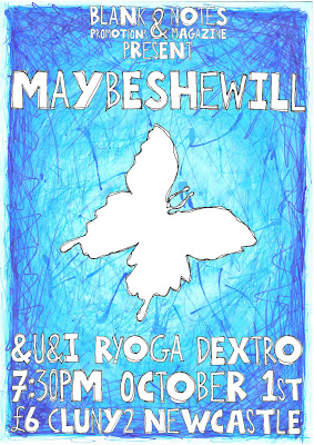
Here's the second of the two posters I've been working on recently, for a gig I'm co-promoting with the chaps at Blank Promotions.

It's for a band called Maybeshewill, who I have seen more times than it is possible to shake a stick at. They generously donated a track to my very own Notes magazine issue 2 ages ago, which people seemed to enjoy listening to rather a lot!

The poster design is pretty simple, the background was just a piece of white card that I covered in various blue pens, inks, paints, pencils and plenty of water to make it all bleed into one mass of colour. Using various different substances for this is interesting as you can't always predict which pens will bleed, despite what the labels say!

The typeface was sketched up in the style of my recipes on this blog, because I've been enjoying doing that sort of stuff recently. I can do it lazily in bed at the end of the day, then wake up to find my work is already done.

Each letter was drawn twice, one fat and one thin. Or whatever the politically correct term is. Wide and narrow? Chubby and stringy? I dunno. All the letters were roughly drawn outlines to begin with, which I then re-drew over the top once more to improve (or worsen) the overall shape of the letter.

To decide if I should use a fat or thin letter in sequence, I flipped a coin. An old five pence (the size of a current ten pence) with a bit of masking tape on either side with an "F" or a "T" on it. I made the F bold there, did you notice? Anyway, this was a very time consuming affair and not something I would recommend. I mean I had fun... but it was pretty boring cutting out all the letters twice with my dodgy photo editing software thing.

There was a bit of cheating when ordering some of the letters, like if there was two of the same letter in a word I made sure to have one of each type... and I gave MSW a fat M before I started flipping the coin. I quite like the end product though, so it's not all bad.

I also drew the Maybeshewill butterfly logo in the same style as the letters, just a rough outline drawn twice, and slapped it in the dead centre of the poster. I originally drew the butterfly from triangles which I've also been using quite a lot... but it didn't fit in with the rest of the picture so I scrapped it.

Anyway, here is the final thing:


Also playing are &U&I, my old pals Ryoga and one-man wonder Dextro.

What do you reckon? I think the butterfly logo was a bit of an obvious choice, but if you recognise it already then you know what the gig is about before you even read it... which I suppose is a good thing! I tried to do it in my own style at least, and I think it worked in the end.

Again, I'll be printing some of these up to sell, but just the background and butterfly with the words "Maybeshewill" (in big letters) and "Notes Magazine" (hidden in a corner) on them.

Thursday, 5 August 2010

Gig Poster: The Pattern Theory

I've not posted anything in a while, because I've been very busy working on two gig posters for events that I'm organising. They're done now, so I may as well post them.

Here's the one for The Pattern Theory, which I posted a previous entry about when I was working on it. The background is a piece of card, and the pattern is ACTUALLY rubber stamped by hand on to it. The main typeface was all hand drawn and scanned in, then used where needed. I did a whole alphabet and numbers, in case I decide to re-use it for a later project. The smaller words were written down as required, scanned and placed on the final design.


Also playing this gig are two excellent one-man band projects: Juffage and Dextro.

I'm thinking about printing some fancy posters with some of the other patterns on them, so you can choose which one you like. What do you think to that idea? It will probably cost me more, but I like a bit of variety.