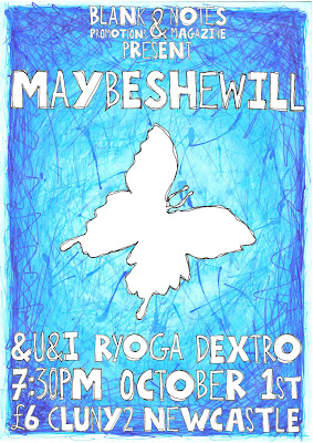
Here's the second of the two posters I've been working on recently, for a gig I'm co-promoting with the chaps at Blank Promotions.
It's for a band called Maybeshewill, who I have seen more times than it is possible to shake a stick at. They generously donated a track to my very own Notes magazine issue 2 ages ago, which people seemed to enjoy listening to rather a lot!
The poster design is pretty simple, the background was just a piece of white card that I covered in various blue pens, inks, paints, pencils and plenty of water to make it all bleed into one mass of colour. Using various different substances for this is interesting as you can't always predict which pens will bleed, despite what the labels say!
The typeface was sketched up in the style of my recipes on this blog, because I've been enjoying doing that sort of stuff recently. I can do it lazily in bed at the end of the day, then wake up to find my work is already done.
Each letter was drawn twice, one fat and one thin. Or whatever the politically correct term is. Wide and narrow? Chubby and stringy? I dunno. All the letters were roughly drawn outlines to begin with, which I then re-drew over the top once more to improve (or worsen) the overall shape of the letter.
To decide if I should use a fat or thin letter in sequence, I flipped a coin. An old five pence (the size of a current ten pence) with a bit of masking tape on either side with an "F" or a "T" on it. I made the F bold there, did you notice? Anyway, this was a very time consuming affair and not something I would recommend. I mean I had fun... but it was pretty boring cutting out all the letters twice with my dodgy photo editing software thing.
There was a bit of cheating when ordering some of the letters, like if there was two of the same letter in a word I made sure to have one of each type... and I gave MSW a fat M before I started flipping the coin. I quite like the end product though, so it's not all bad.
I also drew the Maybeshewill butterfly logo in the same style as the letters, just a rough outline drawn twice, and slapped it in the dead centre of the poster. I originally drew the butterfly from triangles which I've also been using quite a lot... but it didn't fit in with the rest of the picture so I scrapped it.
Anyway, here is the final thing:

What do you reckon? I think the butterfly logo was a bit of an obvious choice, but if you recognise it already then you know what the gig is about before you even read it... which I suppose is a good thing! I tried to do it in my own style at least, and I think it worked in the end.
Again, I'll be printing some of these up to sell, but just the background and butterfly with the words "Maybeshewill" (in big letters) and "Notes Magazine" (hidden in a corner) on them.
No comments:
Post a Comment